FlyTravio
Design demos · Round 01

Two directions · One brand

Same journey. Two ways to tell it.

Both demos are complete, working homepages for FlyTravio — real copy, real destinations, real pricing. Open them side by side and pick the one that feels like you.

Fully responsive India & Australia ready Opens in a new tab
Open Demo 1 in a new tab
flytravio.com — Demo 1
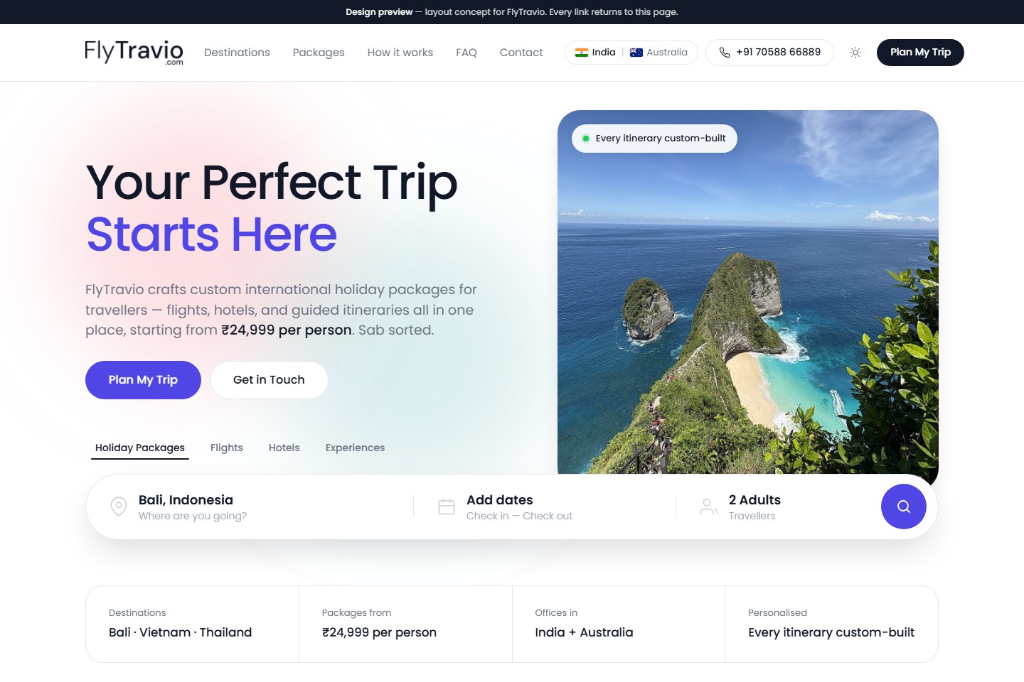
Demo 1 homepage: bright white layout with a large 'Your Perfect Trip Starts Here' headline, a Bali cliff photo and a booking search bar.
Live preview Open ↗
01

Demo 1

Bright · Calm · Easy to scan

Light, open and uncluttered. A clean white canvas, one big confident headline, a single hero photo, and the booking search bar sitting exactly where the eye expects it — with plenty of room left to breathe.

  • Bright & airy
  • Search-first hero
  • Crisp cards & grids
  • Lots of white space
Open Demo 2 in a new tab
flytravio.com — Demo 2
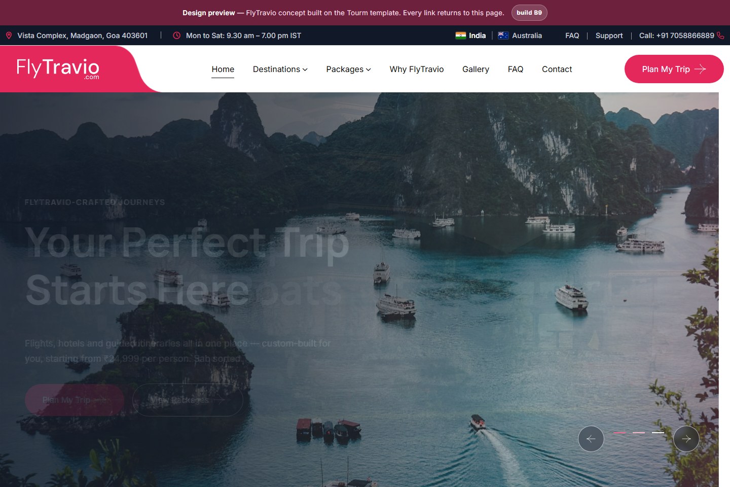
Demo 2 homepage: full-bleed photo of a Balinese lake temple behind the headline 'Your Perfect Trip Starts Here', with a crimson FlyTravio header.
Live preview Open ↗
02

Demo 2

Dark · Cinematic · Photo-led

The same story told in widescreen. Destination photography fills the screen edge to edge behind oversized type, deep crimson runs through the header and buttons, and the page keeps moving as you scroll through it.

  • Full-bleed photography
  • Big cinematic type
  • Deep crimson palette
  • Motion throughout

Not sure? Open both.

Each link launches in its own tab, so you can flick between the two. Every button inside the demos loops back to the same page — nothing is broken, it just isn't wired to a booking engine yet.